GET IN TOUCH
JOIN OUR NEWSLETTER

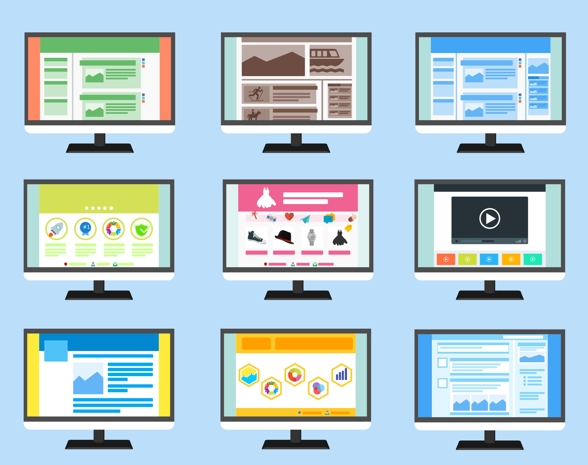
Growth-Driven Design: The next step in the evolution of web design?
Web design practices and principles have changed significantly in recent history. The websites of the 2020s are more interactive and more responsive than ever before. Furthermore, the advent of platforms like WordPress, Wix and Shopify have changed the way websites are built and templated and made web design more accessible. However, whilst the tools and techniques used in web design have evolved, there has been little change to the fundamental strategy and approach of building a website; until now.
Most websites are built based on the principle of creating, perfecting, refining and testing every element before launching a fully finished website (often with some fanfare) into the world. This website then largely languishes in its launch state until it becomes so outdated and not fit for the purpose that a full redesign is required. And then the process begins again. The alternative to this is Growth-Driven Design, a process whereby a website’s design is refined to meet business and customer need over time.
The pitfalls of the traditional web design process
The traditional ‘perfect then launch’ approach to web design can lead to frustrations for all involved in building a website. Web developers find their progress stalled as they wait on content. Content creators struggle to produce flexible content without knowing the design or layout of the space they are required to fill (and what their audience respond to). Whilst managers frequently grow impatient over delays to website launch and the growing budget as designs are slowly refined and bugs are ironed out.
This model of web development has a high lead-in, both in terms of cost and time. Significant investment is required to get to a point where there is something that can be put in front of a customer. Then, because of the task and finish nature of the activity, there is little to no 'feedback loop'. The design is set based on expectations of what customers need, not observed behaviour of what they actually need.

The benefits of Growth-Driven Design
The premise of Growth-Driven Design is simple – your website is continually refined to meet your business and your customers' needs. Needs can be misunderstood, or simply change as time goes on. So, if there is a disconnect between customer need and what a website currently delivers, then action is required. Content and functions are changed, removed or added at the first possible opportunity, rather than being earmarked for the next redesign.
In short, Growth-Driven Design underlines the idea that a high-performing website is never finished; it’s is constantly evolving and improving. To make this approach feasible, this means that the initial launch of the website takes place more quickly, with the expectation that it will be improved and refined over time. This smooths the curve of investment too, meaning upfront time and budget costs are reduced in favour of a longer, more even, investment.
The result of following a Growth-Driven Design model is that the website should more closely meet customer needs. The moment there is a disconnect, action is taken to correct it. In turn, this should lead to greater conversion rates as customer needs are listened to and responded to.
Core principles of Growth-Driven Design
The term Growth-Driven Design was coined by Hubspot as a way of describing their new methodology. It is based upon the following key principles:
• Teamwork – specifically, utilising agile team processes including research and sprints to have everyone working towards a common goal.
• Observing user behaviour (and acting on it) – with Growth-Driven Design, user behaviour and need is continually monitored. This data then drives the actions of designers and content creators.
• Change and growth – as the business grows and evolves, so too will the website.
Growth-Driven Design: the mechanics
There are three steps to the Growth-Driven Design methodology:
• Strategy
• LaunchPad website
• Continuous improvement
Step one: strategy
In this step, the goals for the website (re)design are set, data is collected on user need and behaviour, assumptions and objectives are agreed upon and a conceptual vision for the website is reached. In many ways, this step is very similar to the planning stage of a conventional website design. The difference is that the design will evolve from the decisions made during the strategy phase after launch.

Step two: LaunchPad Website
The LaunchPad website is a complete site that is launched much more quickly than a traditional website launch or relaunch. To some extent, it follows the principle of a ‘minimum viable product’ as it has been developed based on the most critical improvements required, with the knowledge that further refinement will happen later.
Step three: Continuous Improvement
The most defining characteristic of Growth-Driven Design is this final step of continuous improvement. Once the LaunchPad website is live, data on user needs and behaviour is continually collected. If a function or piece of content doesn’t perform or if the business moves in a different direction then rather than a chasm developing between the website and reality, the website is modified to bring it back in line with expectation.
As with step two, the continuous improvement phase is structured according to the agile development model.
How observing user behaviour works
Given that user data and behaviour is so important to Growth-Driven Design, it’s important to be clear on how this can be collected. One of the most powerful tools for observing user behaviour on your website is Google Analytics. This can tell you the demographics of your website visitors, the pages they visit, how long they are on each website page and where they drop off. This observed behaviour on the LaunchPad website is critical to know what changes are needed.
However, you have an even wider set of tools at your disposal; performance of paid ads, activity on your social media channels, newsletter sign-ups and opens and sales performance figures can all help to build up a picture of your customers and their behaviours. As these patterns of behaviour change, so too must your web design. This means that your website is based upon data and observation, rather than assumption and expectation.
Examples of Growth-Driven Design in practice
If you’re unsure what Growth-Driven Design might look like in reality, or what kind of actions may arise from the approach, we’ve put together some examples.
1. Content creation
To some extent, every website that is updated with new content like blog posts and news articles is following some principles of Growth-Driven Design. The website owner is recognising that users would benefit from a new piece of information or detail that the current website doesn’t provide.
However, in this context, we are thinking about more major content changes. Growth-Driven Design can facilitate adding new functionalities and structures to your website that support the provision of new content.
You may consider adding a gallery of images, a slider of testimonials, a calendar of upcoming events or new materials like podcasts, videos and downloadable resources. Furthermore, you should use the behaviour of users on your website to learn what kind of content is popular with and performs well with your audience. It is then simply a case of facilitating adding more of this type of content to your website. For inspiration, why not check out our blog post on
10 tools and features to maximise your website’s conversion potential.

2. Branding and rebranding
When a company undergoes a major rebrand this often prompts a website redesign. For example, a new logo or corporate colour palette can act as a catalyst for a whole new visual approach to a company's online presence. However, Growth-Driven Design allows for smaller and subtler improvements. Perhaps, rather than changing your whole brand and colour identity, you would just like a more contemporary visual style. Under the Growth-Driven Design methodology, you could user-test small tweaks to fonts and imagery and make improvements across your website that modernise the overall appeal without requiring a complete redesign.
3. Testing and design
Growth-Driven Design gives content creators, web designers and business leaders a lot of freedom to test and try new things. Under a conventional web-build approach there is a ‘one-shot’ mentality. You try and predict exactly what your users will need and then you build something you hope meets this need. If it doesn’t, then any lessons you learn are rarely acted upon until the next major redesign, however many years down the line that may take place. Under the principles of Growth-Driven Design, nothing is set in stone. This means that you have the freedom to experiment with copy, headings, colour schemes, button placement, hero images, call-to-actions…in short, any element of your website. If something isn’t working then you simply try something new.
4. User experience
Whilst this overlaps with the other examples, user experience is at the heart of Growth-Driven Design. You may think you’ve designed the best and most effective website imaginable. But if it’s not working for your users then it’s not working. With Growth-Driven Design, the changing needs of your users and what they respond well to informs the next phase of design.
Growth-Driven Design: A summary
To some business owners, the message that a website is never finished may be a difficult one to accept. Growth-Driven Design keeps your website near the top of your work agenda all year round. There is no post-launch let-up; instead, the hard work really begins after launch. However, the reward is a website that more closely meets business goals and customer needs. This continual evolution spreads time and money investment and creates the freedom for experimentation and the opportunity to act on data, not assumptions.
Is it the next step in the evolution of web design? We think it just might be. The conventional model of web design detaches the end product from the user. This has led to criticism, prompting industry figures like Gabe Wahaab to say that ‘the traditional web design model is totally broken.’ Growth-Driven Design presents us with a never-ending opportunity to get things right – to meet customer needs, however, often they change. As web designers and business leaders that is one goal we always have in mind.
Get help with Growth-Driven Design
At QuayClick we work closely with our customers and so the Growth-Driven Design methodology is a natural extension to our working approach. We get to know our customers and their businesses and as your business changes and grows we're there to help you react.
Following a Growth-Driven Design methodology, we act as your web-developer partner throughout your business journey. We can help you to keep your website current and effective; observing how users behave and adapting design and content accordingly. To find out how we could help you, please
contact us in Exeter today.


QUAY HOUSE
KINGS WHARF
EXETER | EX2 4AN
01392 793633
HELLO@QUAYCLICK.CO.UK
QUICK LINKS
QC Newsletter sign-up
We’re a website design and digital marketing agency based in Exeter. We help businesses grow online and have over 20 years of experience in Web Design. We offer several inbound strategies, including paid search and SEO. In addition, our content team can help with copywriting and email campaigns.