GET IN TOUCH
JOIN OUR NEWSLETTER

7 web design and copywriting tips to create the perfect homepage

A high-performing homepage blends visual and written mediums perfectly to create something that appeals to customers at every level. This winning combination of effective web design and targeted, well-written copy isn’t easy to achieve. But, when a business succeeds in this area, the effect on sales and conversions can be remarkable. We share our top web design tips for creating the perfect homepage.
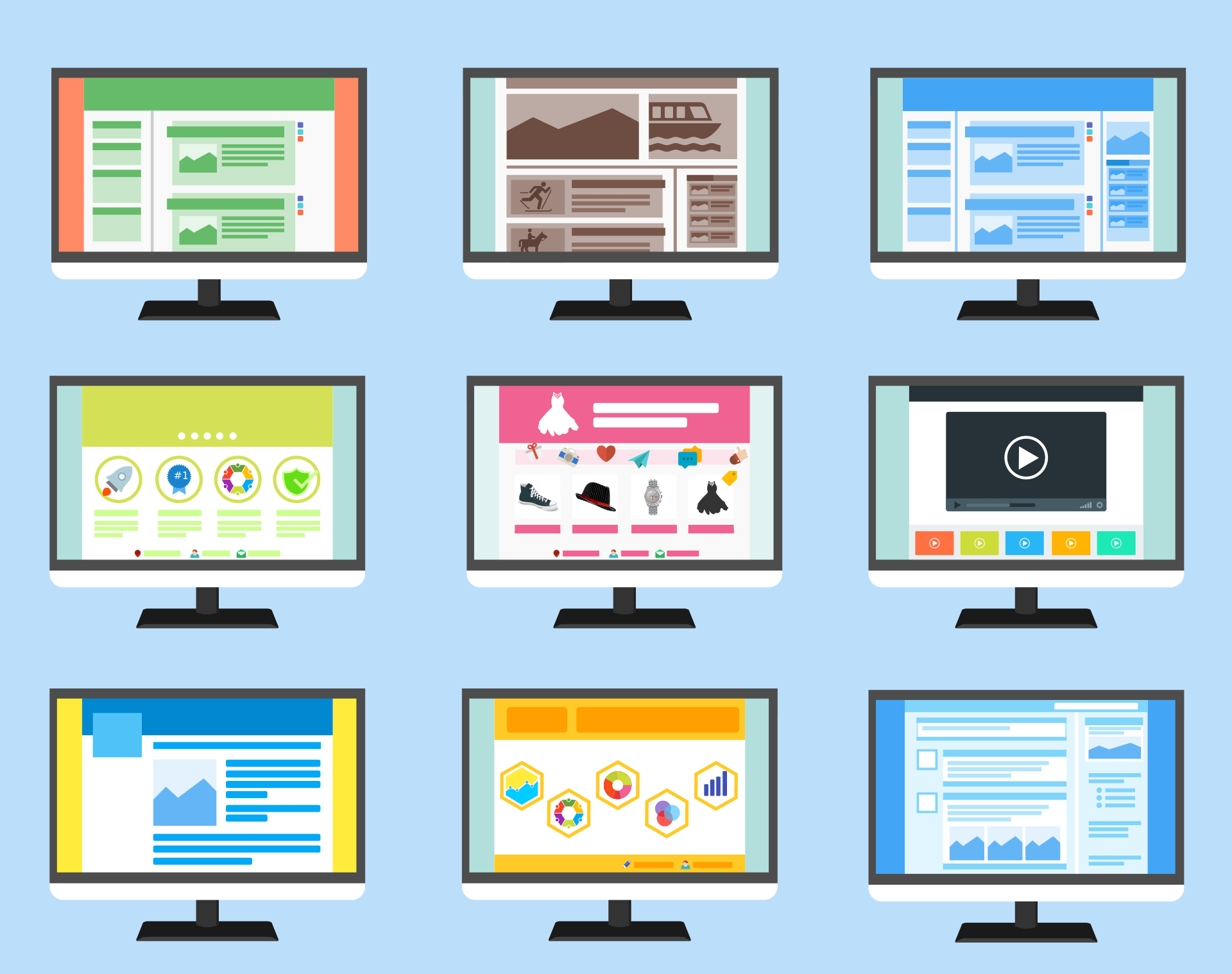
1. Simple, bold, uncluttered designs work best
We’ve all seen websites that attempt to fit too much on to their homepage. They’re off-putting and rarely win over customers. The same goes for chaotic and busy layouts and designs. We’ve blogged previously about users making a decision on a website in 0.05 seconds and that 94% of first impressions relate to a website’s design. Adopting a simple, visually appealing website design is the best way to make a good first impression.
2. Write a strong headline and feature it prominently
The headline on a website’s homepage is considered by many to be the single most important line of copy on a website. According to digital marketing guru Neil Patel,
five times as many people read the headline as the body copy. A strong headline can even
increase conversion rates by up to 40%! A good website headline is generally 5-12 words long and directly engages the reader. Getting it right takes time, however, and Neil Patel recommends testing around 25 variations of your headline with audiences to identify what works.

3. Pick a hero image that sells your business
Many websites feature a ‘hero’ image – it’s generally at the top of your website’s homepage, directly below any navigation. The hero image should closely link to a business’ activity and ethos and inspire an emotion in the viewer. Research has shown that most people remember 65% of the visual content that they see on a website three days later, compared to only 10% of the written content. For this reason, it’s worth investing in a hero image that will really resonate with your customers, and a generic office-environment stock image is unlikely to achieve this.
4. Write for your customer, not your business
Too often, businesses write only about their company and products – they talk about features, sales records, history, staff, reputation and values when they should be talking about customer benefits. Donald Miller, in his bestselling Building a Storybrand book argues that businesses fail when they make themselves the hero of their story. Customers want to be the hero, they want to know how a business can help them achieve a goal that matters to them, and anything else is just noise. When writing homepage text, everything should relate to the customer – how will they benefit from buying from your business and why will their life be better as a result?
5. Position your call-to-action where it will get a result
When a potential customer arrives at your homepage you want this visit to convert. Your conversion goal could be a sale, a newsletter sign up, a contact enquiry or something else that matters to you. What’s important is that you successfully direct that customer wherever you want them to go. The most common medium for this is a call-to-action (CTA) button. Your call-to-action should be clearly identifiable, without scrolling and be free from the clutter of surrounding content. Read our blog post on the psychology of colour to discover how web-designers can even use the colour of call-to-action buttons to increase conversions.
6. Be concise
When writing web copy it can be tempting to create a longer page. After all, a lengthier homepage increases the scope for featuring keywords and producing copy that can help with SEO. However, whilst this approach can work on blog posts, it’s not good practice for a homepage. When it comes to homepages, succinct, short-form content works best. CRM company pipedrive, tested short and long variants of their homepage to see which performed better. The shorter version achieved
a 300 percent increase in conversions compared to its wordier counterpart.

7. Use social proof to give customers confidence
Social proof can come in many forms and combines web design and copy to present an evidence bank to potential customers of your reliability. Examples include testimonials, client logos, customer stories, awards, certifications & accreditations, reviews, media coverage and statistics (e.g. number of customers or subscribers, league table rankings etc.). Written social proof should be short and factual. In the context of testimonials, these should be in the client’s own words. If featuring case studies they should clearly describe the work done for the client. Logos, accreditations and awards should be prominently featured with links included for clarity.
Website design and copy – getting the right balance on your homepage
Web design and content are often complementary, but on a homepage this relationship is more important than ever. Both elements need the space to showcase your business in the best possible light, but an overabundance of either one is likely to confuse your customers. When planning or redesigning your homepage you should always keep your customer in mind and consider how your visual design and written content can most clearly and simply, connect you with your customer. And remember that your customer, and not your company, is the hero of your story.
Help with website design
For many visitors, your homepage, will be the entry point to your website and will influence how likely they are to convert. At QuayClick, we know how to create a homepage that makes a winning first impression. We combine effective and visually appealing website design with focussed copy that engages your reader. To find out how we could help you, get in touch with us in Exeter today.


QUAY HOUSE
KINGS WHARF
EXETER | EX2 4AN
01392 793633
HELLO@QUAYCLICK.CO.UK
QUICK LINKS
QC Newsletter sign-up
We’re a website design and digital marketing agency based in Exeter. We help businesses grow online and have over 20 years of experience in Web Design. We offer several inbound strategies, including paid search and SEO. In addition, our content team can help with copywriting and email campaigns.