GET IN TOUCH
JOIN OUR NEWSLETTER


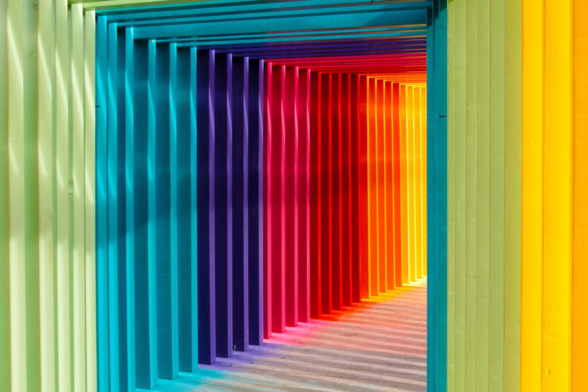
The psychology of colour and its role in website design and branding
We're highly visual in the way we consume media and view the world.
According to social media site Buffer,
over 90% of our assessment of a product is based on colour alone. But how important is colour to web design? Well, it may surprise you to learn that the colour scheme on your website could be directly affecting your conversions. We take a look at colour psychology and its role in web design.
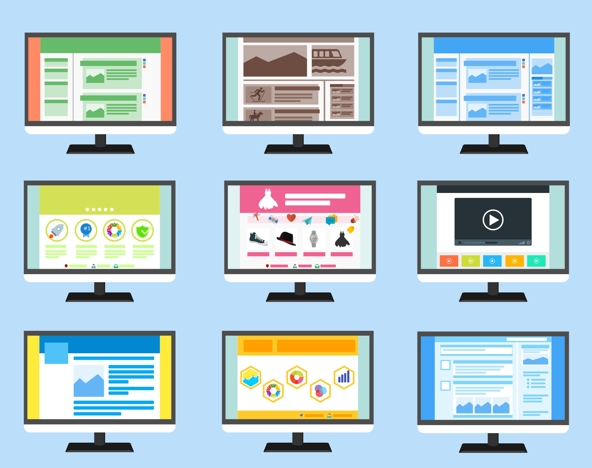
Colour and first impressions of website design
We wrote recently about the impact of web design on sales, profitability and consumer confidence. Website visitors make rapid assessments, with users making a decision on a website in just 0.05 second. And 94% of those first impressions relate to a website's design. Colour can be a major component of design and a website's colour scheme affects headers, buttons, menus, banners and imagery. Digital marketing expert Neil Patel discusses the psychology of colour in web design and argues that adjusting colour, alongside other design elements can increase conversions by as much as 24%.
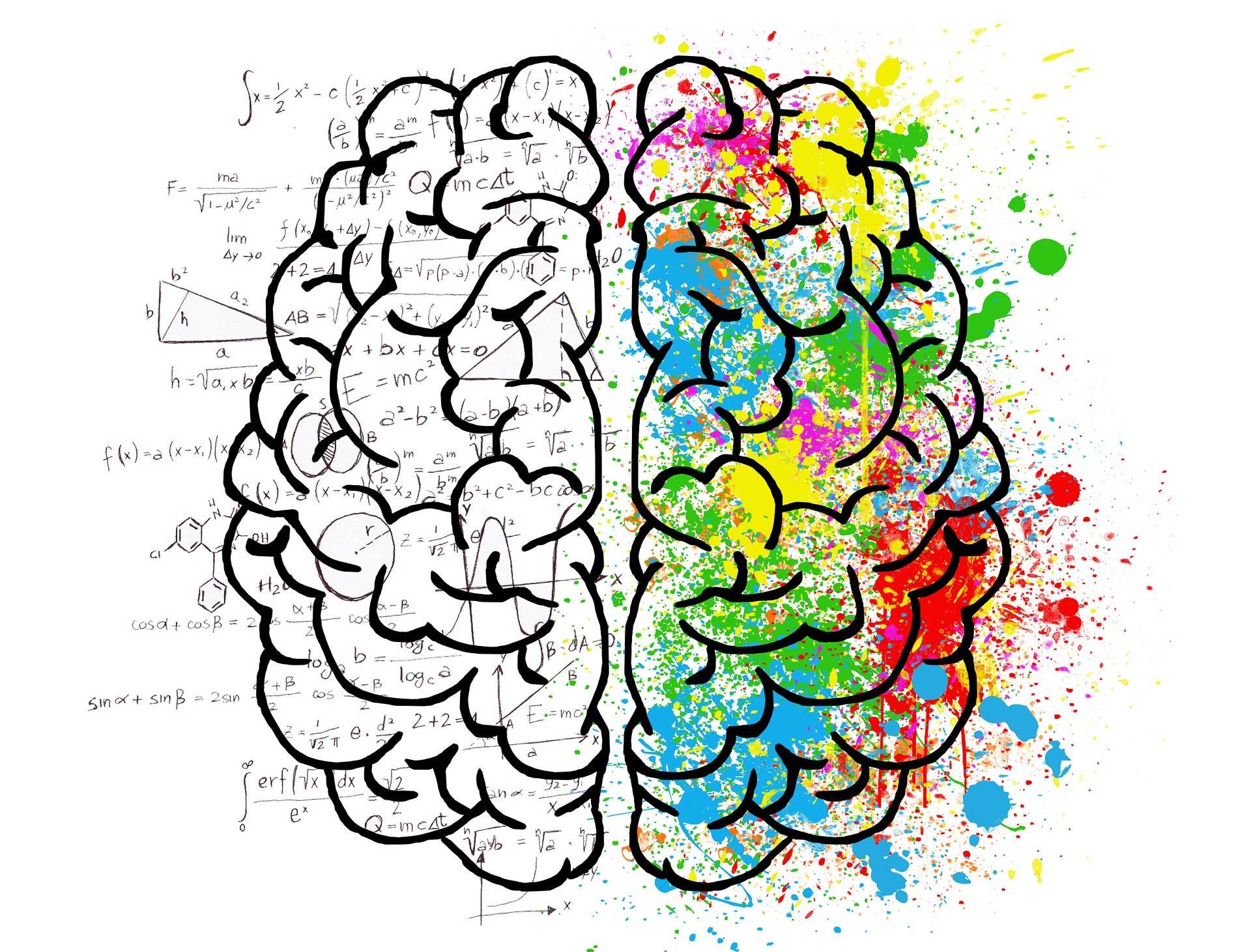
The art of colour psychology
We recognise a lot of colour coding from storytelling, sayings and popular culture. Red often represents danger whilst the colour green has environmental and natural world connotations - gardeners are said to have green fingers. Yellow is often seen as an alert - consider yellow warning signs, yellow a-frames or cones warning of wet floors and traffic lights. But colour psychology goes deeper than this and website designers, marketers and branding experts use colour to direct our behaviour.
Using colour in branding
Colour has been shown to influence people's mood, behaviour, stress levels and even their appetite. It's why it's such an important factor in branding and design. Colour has been shown to increase brand awareness by 80% and it also directs us how to feel about that brand. As an example, blue is often used to convey reliability and trustworthiness. It's a calming colour, favoured by banking and financial institutions (Barclays, Capital One and PayPal) and communications brands (Facebook, Twitter and Samsung). But it's a colour avoided by many food brands - blue is an appetite suppressant and a colour we rarely associate with foods we'd wish to eat.
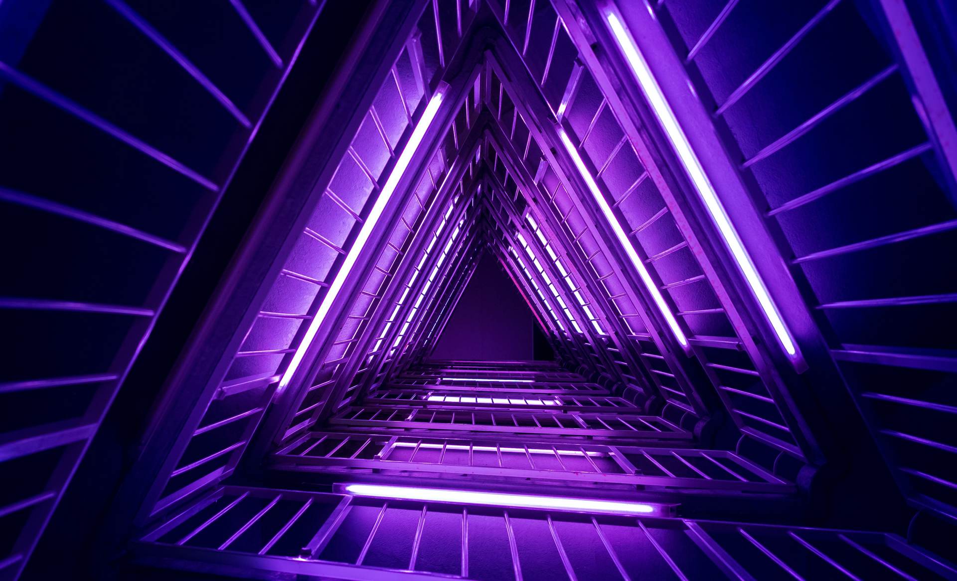
There are many other examples of the link between colour and brand - orange is often seen as fun, energetic and youthful (Orange, easyJet, Fanta, and Tango) but is less suited for serious or luxury brands. Darker purples can be associated with this sense of luxury and even nobility or royalty. Whilst
lighter lavender shades can be seen as more feminine, sentimental, and even nostalgic.
Colour in the world of web design
Whereas muted, more neutral tones were once the convention for web design palettes, bolder, brighter colours are becoming increasingly popular. Bold colours make an instant statement, especially when combined with flat design websites. However, your website still needs to work for visitors - bright text against a bright background clashes and is hard to read. It's why we rarely see green text on bright red backgrounds.
Whilst brand colours are a natural starting point for web colour schemes, if you're just starting out look at your competitors to see what works in your industry and how you can better their web design.
Colour and website functionality
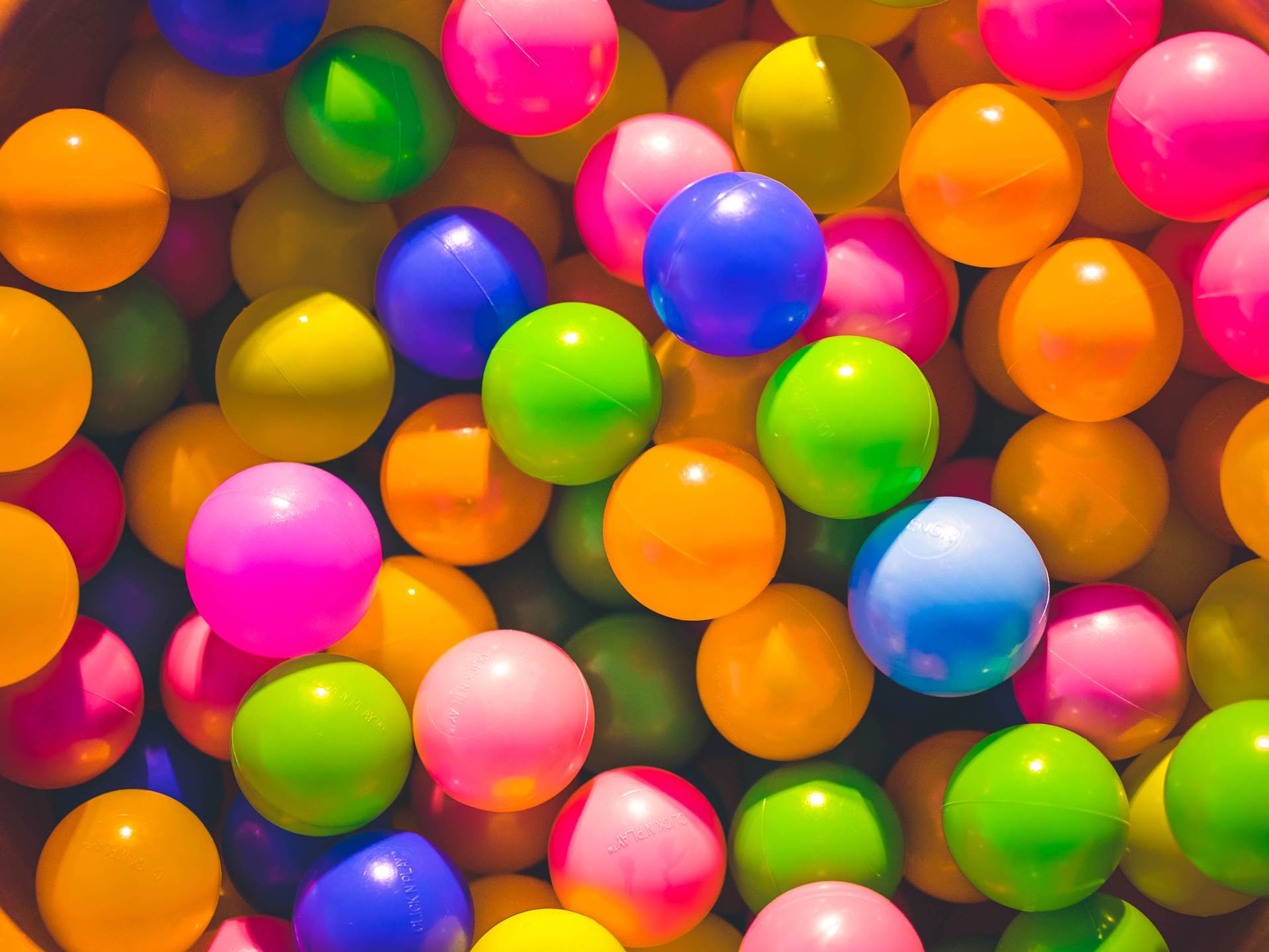
As well as picking colours that complement your brand and have visual appeal, research has shown that colour can be used to direct visitor behaviour on your website. Neil Patel reports that in testing environments bright primary and secondary colours rank best for conversions. Red, orange and yellow are therefore much better at securing a conversion than darker blacks, greys, browns or purples. This is particularly significant in the context of call to action buttons. Performable.com experienced a 21% increase in conversions by changing they call to action button colour from green to red. A similar switch from green to yellow by RIPT clothing company secured a 6.3% increase in sales.
And it doesn't just work for CTA's. According to Canva, colour makes a big difference on banner ads. The same ad with a green background performs differently to a yellow or red one. Amazon use orange in their 'limited time offer' banner - a colour associated with urgency and action.
Blue is also effective on homepages and landing pages - which makes sense if we revisit that idea of blue as a trustworthy and reliable colour.
Pick colours that work for your target market
It's worth remembering that we don't all see colour the same way and when you design a website you should have your target market in mind. It's a big generalisation, but
studies show that primary colours such as blue, green and purple appeal to women, who are less taken by earthier tones such as browns, oranges and greys. Whilst men, conversely, prefer blues, blacks, and greens. In terms of age, children like lighter shades and pastels and older users prefer brighter, bolder colours.
Some final tips on website colour schemes
We've put together our final tips to keep in mind when designing a website:
- Remember Mark Zuckerberg and the 4.5% of the population who are on the colour blindness spectrum. That means roughly 2.7 million people in Britain.
- Some colours suit an industry, product or service, but you also want to stand out.
- Limit your range of colours so websites don't become too busy.
- Think about variations around a theme. Base the colour palette on one main colour and then use neutral colours around them
- Colour can come from the artwork or photography, rather than logos or themes.
- Readability is crucial. Light text against a darker background can be powerful, but should be used with caution. In practice, this works best for headlines and larger text sizes.
- Consider the demographics and cultural leanings of your audience.
- Most importantly, your aim is to dazzle and delight your customers.
A web designer's perspective on colour
If your website needs a fresh new look and colour scheme or you're simply struggling to decide on a colour palette that works online, it pays to get a fresh perspective. The right colour scheme on your website gives your brand personality and makes you instantly recognisable, which is perhaps just the competitive edge you need. At QuayClick, our experienced web designers can work with you to
design a website that looks great and complements your brand and style.
Contact us in Exeter today to find out how we could help.


QUAY HOUSE
KINGS WHARF
EXETER | EX2 4AN
01392 793633
HELLO@QUAYCLICK.CO.UK
QUICK LINKS
QC Newsletter sign-up
We’re a website design and digital marketing agency based in Exeter. We help businesses grow online and have over 20 years of experience in Web Design. We offer several inbound strategies, including paid search and SEO. In addition, our content team can help with copywriting and email campaigns.